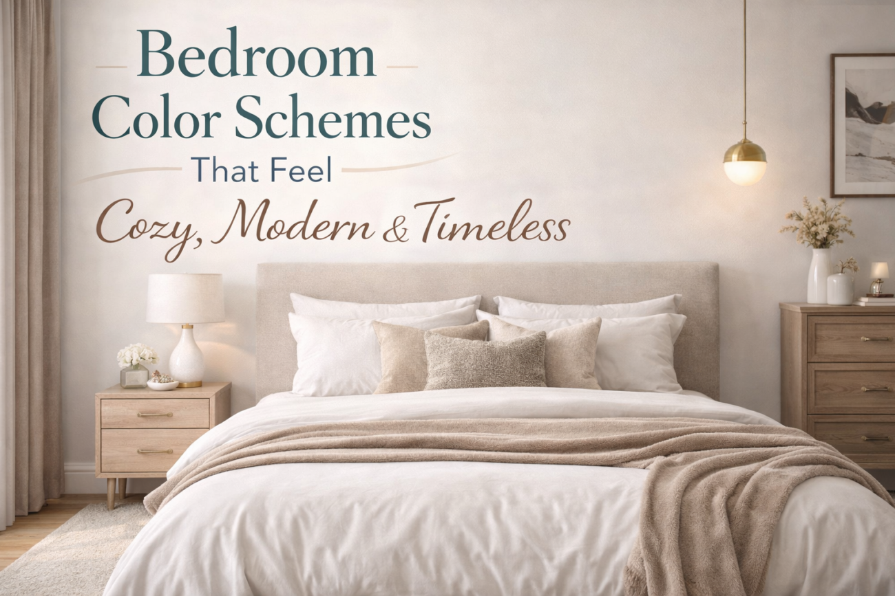
Whether you’re starting from scratch or just craving a refresh, these color combinations will transform your bedroom into the sanctuary you’ve always dreamed of.
Your bedroom is the one room in your home that’s entirely yours. It’s where you start and end every single day, which means the colors you surround yourself with really do matter more than you might think. The right palette can make a small room feel expansive, a cold room feel wrapped in warmth, and a dated space feel effortlessly fresh.
We’ve rounded up 16 of the most beautiful, livable, and Pinterest-worthy bedroom color schemes — the kind that look just as good in real life as they do on a mood board. From warm neutrals to moody jewel tones, there’s something here for every taste, every home, and every budget. Let’s get into it.
Warm Neutral
1: Warm Linen & Soft Ivory
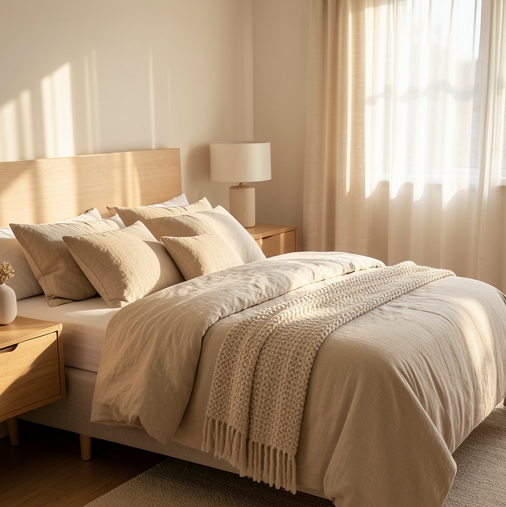
IvoryLinenWarm Gold
If there’s one color scheme that never goes out of style, it’s warm linen and soft ivory. This combination feels like a Sunday morning — unhurried, calm, and deeply comfortable. Layer different textures across your bedding, curtains, and area rug in tones of cream, oatmeal, and flaxen linen, and you’ll create a bedroom that feels curated without trying too hard. The key is variation within a very close tonal range, so nothing shouts but everything whispers beautifully together.
To keep this palette from feeling flat or boring, add warmth through natural materials — a rattan pendant light, linen throw pillows with subtle fringe, aged brass hardware on your nightstand. A single warm gold accent, whether it’s a lamp base or a picture frame, elevates the entire room and gives the eye somewhere interesting to land. This scheme works brilliantly in small bedrooms because the light, airy tones make walls visually recede, opening up every inch of the space.
Earthy Tones
15 Smart Bedroom Ideas for Small Rooms to Maximize Space
2: Terracotta & Warm Cream
TerracottaWarm CreamRaw Sienna
Terracotta has had its moment on Pinterest — and honestly, it’s showing no signs of slowing down because it just works. Paired with warm cream, it creates a bedroom that feels Mediterranean and grounded, like somewhere you’d find in a Moroccan riad or a sun-washed Italian villa. Use terracotta as an accent wall color or weave it through your textiles — a duvet cover, a knit throw, a stack of pillows — while keeping the rest of the room in creamy off-white neutrals.
What makes this palette feel modern rather than dated is restraint. You don’t need to go all-in on terracotta everywhere. Instead, let it breathe alongside raw linen, unglazed ceramics, and natural wood tones. Houseplants in simple clay pots tie the whole thing together and bring a little life to the earthy warmth. This is the kind of bedroom that photographs beautifully in the morning light and feels like a hug when you walk in after a long day.
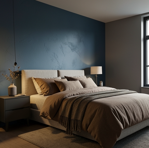
Moody & Dramatic
3: Deep Forest Green & Warm White
Forest GreenWarm WhiteBrass
If you’ve been dreaming of a bedroom that feels like a five-star boutique hotel, deep forest green is your answer. Rich, enveloping, and surprisingly versatile, this shade of green carries all the restfulness of nature indoors. Paint all four walls, or go bold with a dark-painted ceiling to wrap the room in cozy atmosphere. Against warm white bedding and natural wood furniture, the green feels sophisticated rather than overwhelming — it’s the kind of color that makes a room feel intentional and deeply considered.
Brass accents are this palette’s best friend. Think brass cabinet hardware, a sculptural brass reading lamp, or a vintage-style mirror with a warm metal frame. These golden undertones warm up the coolness of the green and keep the space from feeling too stark. Layer in some textured linens, a sheepskin throw, and a few trailing plants, and you’ve got a bedroom that looks like it came straight off a Pinterest board — moody, modern, and completely irresistible.
Soft Romance
4: Dusty Rose & Blush Beige
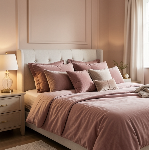
Dusty RoseBlush BeigeWarm Taupe
Dusty rose is not your grandmother’s pink. In its most sophisticated form — muted, slightly greyed, and paired with warm blush beige — it creates a bedroom that feels romantic, grown-up, and completely timeless. This palette is particularly flattering because the warm undertones bathe the room in the most gorgeous soft light, the kind that makes everything and everyone look a little more beautiful. Use it on a feature wall or through your textiles for instant bedroom magic.
The trick to making dusty rose feel modern is layering it with warm taupes and creams rather than stark white, which can make it look too saccharine. A linen duvet in blush beige, a chunky-knit throw in oatmeal, and warm taupe curtains that pool slightly on the floor — this is the combination that goes from “pretty” to “stunning.” Add a vintage-inspired chandelier or a simple rattan pendant and you’ve got a bedroom that’s equal parts dreamy and refined.
Modern & Minimal
Scandi Minimal
15 Black Couch Living Room Decor Ideas That Look Expensive
5: Soft White & Cool Grey
Soft WhiteCool GreyWarm Stone
Clean, calm, and endlessly elegant — the soft white and cool grey bedroom is a design classic for good reason. This Scandinavian-inspired palette strips everything back to the essentials, creating a space that feels genuinely restful rather than clinically cold. The key is choosing whites and greys with the right undertones: warm stone whites rather than blue-tinged bright whites, and soft mid-toned greys rather than anything too harsh or industrial. When done right, the result is quietly beautiful.
To prevent this palette from feeling sterile, texture is everything. Think chunky woven throws, linen pillowcases, a wool area rug, and some simple wooden furniture with visible grain. A few carefully chosen objects — a ceramic vase, a stack of books, a simple framed print — add personality without cluttering the calm. This is the bedroom for the person who wants to wake up feeling clear-headed and at peace every single morning.
Urban Modern
6: Charcoal & Warm Nude
CharcoalWarm NudeMatte Gold
Charcoal walls have a way of making a bedroom feel instantly grown-up and seriously stylish. Paired with warm nude tones in the textiles and furniture, the combination avoids the trap of feeling heavy or oppressive, instead landing somewhere between dramatic and cozy that’s genuinely hard to achieve. Think of charcoal as a dark neutral — it actually makes colors alongside it look more saturated and alive, so your warm nudes, taupes, and creams will glow against it in the most flattering way.
Lighting is the secret ingredient in a charcoal bedroom. Since the walls absorb light rather than reflecting it, you’ll want to layer multiple warm light sources — bedside table lamps, sconces, and perhaps some LED strip lighting behind a headboard for a soft ambient glow. Matte gold or brushed brass fixtures tie the palette together and add just enough luxury to elevate the space. The result is a bedroom that feels like it belongs in a high-end apartment, no matter what size it actually is.
Coastal Cool
7: Soft Blue & Sandy White
Soft BlueSandy WhiteDriftwood
There’s a reason coastal-inspired bedrooms never go out of style — that combination of soft blue and sandy white carries a built-in sense of calm that’s almost impossible to replicate with any other palette. This isn’t about nautical stripes and seashell collections; it’s about capturing that feeling of standing at the edge of the sea, the light slightly diffused, the air fresh and clean. A muted, almost-grey blue on the walls with sandy white bedding and natural wood tones is the modern, sophisticated take on coastal style.
Driftwood-toned furniture — pieces that look sun-bleached, lightly washed, or naturally weathered — grounds the palette and prevents it from floating away into something too airy or insubstantial. Woven jute rugs, linen curtains, and baskets add texture and organic warmth. Keep the accessories simple: a few smooth stones, a simple ceramic lamp, a print of water or open sky. This bedroom should feel like a permanent exhale — and with this palette, it absolutely will.
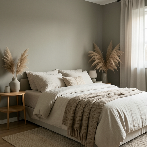
Nature-Inspired
8: Sage Green & Warm Oatmeal
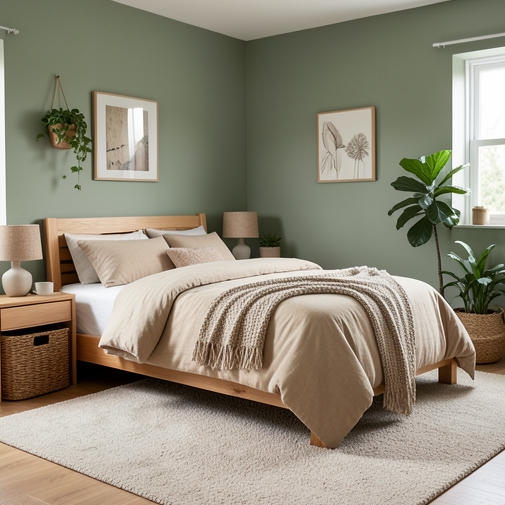
Sage GreenOatmealWarm Mushroom
Sage green might be the most universally flattering wall color available right now, and it’s earned every bit of its popularity. Soft, muted, and green in the most gentle way, it brings the restorative quality of nature indoors without feeling like you’re sleeping in a forest. Against warm oatmeal and mushroom tones, sage green creates a bedroom that feels naturally balanced — neither too warm nor too cool, neither too bold nor too bland. It simply feels right, in a way that’s hard to articulate but impossible to ignore.
This palette pairs beautifully with natural materials across the board. Linen bedding in oatmeal or off-white, a rattan headboard, raw wood nightstands, and terracotta or stone ceramics on the shelves — every natural texture you add makes the green feel more intentional and more alive. For something a little unexpected, try a warm mushroom-toned rug with a subtle texture; it anchors the room and adds a layer of quiet sophistication that ties everything together without you quite being able to put your finger on why it works so well.
Bold & Beautiful
Jewel Tone
9: Deep Navy & Warm Cognac
Deep NavyCognacWarm Brass
Deep navy and warm cognac is the kind of color combination that looks impossibly sophisticated in person and even more stunning in photos. Navy walls create an enveloping, cocoon-like feeling — the bedroom equivalent of closing the door on the rest of the world. The cognac comes in through leather, wood tones, and warm-tinted textiles, adding depth and richness that keeps the navy from feeling cold or corporate. Together they create a bedroom that feels like a private gentlemen’s library crossed with a luxury suite — and that’s a very good thing.
Warm brass fixtures are non-negotiable here: bedside lamps with brass bases, a brass-framed mirror, drawer pulls that catch the light just so. Velvet is another texture that absolutely thrives in this palette — a cognac velvet headboard or a pair of navy velvet throw pillows will make the whole room feel expensive in the best possible way. Layer your lighting carefully so the navy walls glow rather than simply darken, and you’ll have a bedroom that feels like the most glamorous, cozy retreat imaginable.
Luxe & Moody
10: Plum & Champagne Gold
PlumChampagneGold
Plum is a color that commands attention — it’s rich, complex, and instantly luxurious in a way that few other colors can match. As a bedroom wall color paired with champagne gold and warm cream, it creates a space that feels like pure indulgence without tipping into overwhelming. The purple tones in plum shift beautifully depending on the light: in natural daylight it reads more heathered and berry-toned, and in the evening with warm lamp light it becomes deeply, gloriously rich.
Champagne gold textiles are the perfect counterpart — think a satin or silk-look duvet cover, gold-threaded cushion covers, or a light-catching metallic thread woven through your curtains. Pair these with warm cream accents and natural wood for balance. This palette loves a beautiful headboard: a tall, upholstered style in plum velvet or a champagne-toned fabric makes an immediate statement and anchors the whole room. If you’ve been playing it safe with neutrals and you’re ready to commit to something genuinely spectacular, this is the palette that delivers.
Warm Contrast
11: Burnt Orange & Soft Cream
Burnt OrangeSoft CreamWarm Brown
Burnt orange might sound bold for a bedroom — and it is — but in the right doses, it’s also wonderfully cozy and completely timeless. Think of it like the warm glow of candlelight translated into a wall color or a rich textile. Used as a single accent wall behind the bed, or threaded through cushions, throws, and a statement rug against a soft cream backdrop, burnt orange creates a bedroom with the kind of warmth that makes you want to nest in it from October through March and never leave.
Keep the base palette deliberately light and airy — soft cream walls, white bedding, pale wood furniture — and let the burnt orange add the drama. A burnt orange linen duvet, a handwoven Moroccan rug in warm terracotta tones, a single statement cushion in a deeper rust shade: these small introductions create enormous impact. Warm brown leather details and dark wood accents give the palette a grounded, slightly vintage edge that stops it from reading too trend-driven or seasonal. It’s the perfect bedroom for someone who wants warmth without going full terracotta.
Muted & Elegant
12: Slate Blue & Warm Stone
Slate BlueWarm StonePebble
Slate blue sits in that perfect middle ground between cool and warm — it has enough blue to feel calm and airy, and enough grey to feel grounded and sophisticated. Paired with warm stone and pebble tones, it creates a bedroom with a quiet, considered beauty that doesn’t shout or perform. This palette is particularly effective in rooms with good natural light, where the slate blue will shift and deepen throughout the day, giving the room an almost painterly quality as the light changes.
Stone-toned linen is this palette’s natural partner — in a duvet cover, curtains, or an upholstered headboard, that warm, slightly rough texture brings exactly the right counterpoint to the coolness of the blue. Add pebble-toned accessories in matte ceramics, a natural jute rug, and some simple wooden furniture with a light stain, and the room takes on the feel of a beautiful coastal stone cottage — effortlessly elegant and completely livable. This is genuinely one of those palettes that looks better in real life than in any photo.
Classic & Timeless
French Country
13: Aged White & Lavender Mist
Aged WhiteLavender MistWarm Wheat
Aged white and lavender mist together create a bedroom that feels like it was lifted straight out of a Provençal farmhouse — feminine without being fussy, romantic without being overdone. The aged white brings warmth and character that bright stark white can never achieve, while the lavender mist adds just a whisper of color that reads almost like a shadow or a memory rather than a bold design choice. It’s one of those palettes that feels completely effortless, even though it’s been thoughtfully assembled.
Worn, slightly distressed furniture works perfectly here — an aged wooden bed frame, a vintage dresser with peeling paint, a rattan chair with a handmade cushion. Layer in warm wheat tones through textiles: a woven blanket, a linen pillow in a slightly deeper lavender-beige. Fresh or dried flowers on the bedside table — lavender bundles, white garden roses, or dried pampas grass — are the finishing touch that brings this palette fully to life. It’s a bedroom that feels collected over time, not decorated all at once.
Classic Contrast
14: Crisp White & Ebony Accents
Crisp WhiteEbonyWarm Gold
White and black is perhaps the most enduring color combination in interior design — and in a bedroom, it achieves a kind of graphic, editorial beauty that never dates. The trick is keeping the white warm rather than cold, and using the ebony in thoughtful, restrained doses rather than half-and-half. Think crisp white walls with an ebony-stained bed frame, black-framed artwork leaning against the wall, and matte black hardware on white bedside tables. The contrast is striking without being harsh.
Warm gold is the essential third element that stops this palette from feeling stark or editorial in a way that’s too cool for a bedroom. Gold table lamps, a gilded mirror, brass drawer pulls — these warm touches turn a graphic black-and-white room into something genuinely inviting and human. Texture also does important work here: a soft white boucle throw, a woven cushion in off-white, a jute rug underfoot. These layered textures add the warmth and softness that the color palette keeps at bay, creating a bedroom that’s both visually striking and deeply comfortable.
Warm Monochrome
15: Caramel & Toffee Layers
CaramelToffeeButterscotch Cream
A warm monochromatic palette built around caramel and toffee is one of those design ideas that sounds simple but delivers something surprisingly rich and complex in practice. When you layer different tones, shades, and textures within the same warm amber-brown family, the result is a bedroom that feels woven together rather than designed — like every piece belongs there naturally, without being deliberately matched. This palette is endlessly warm and cozy, the visual equivalent of wrapping yourself in a cashmere blanket.
Varying texture is what makes monochromatic rooms work: a smooth leather headboard in caramel alongside a chunky hand-knit throw in butterscotch cream, a glossy ceramic vase in warm amber beside a rough-hewn wooden tray. The interplay between matte and shine, rough and smooth, light and dark within the same warm tone family creates all the visual interest you need without introducing a second color. Add warm amber lamp light in the evenings and this bedroom becomes genuinely magical — cozy, rich, and completely enveloping.
Forever Classic
16: Greige & Natural Linen
GreigeNatural LinenWarm Sand
If you want a bedroom color scheme that will look just as beautiful in ten years as it does today, greige and natural linen is your answer. Greige — that perfect blend of grey and beige — manages to be both warm and cool, both neutral and interesting, in a way that no other color quite achieves. It reads differently in every light: cooler and more sophisticated in bright morning sun, warmer and more enveloping in the evening. Against natural linen, it creates a backdrop so quietly beautiful it makes everything you put in front of it look curated.
This palette is the ultimate foundation bedroom — once you have it, you can add almost any accent color and it works. A pop of rust in a throw pillow, some sage green from a plant, a warm wood bookcase, even a bold piece of artwork — greige and linen accept it all graciously. Keep your furniture simple, your hardware warm, and your textiles layered and tactile. A well-made bed dressed in natural linen with a mix of pillow sizes and a loose, generous throw is all this bedroom ever needs to look like the calmest, most beautiful room in the house.
Find Your Perfect Palette
The best bedroom color scheme isn’t the one that’s most on-trend or most pinned — it’s the one that makes you feel exactly how you want to feel when you walk through your bedroom door. Whether that’s cocooned and cozy, crisp and calm, or somewhere deliciously in between, one of these 16 palettes has your name on it. Save your favorites, pull some samples, and trust your instincts. Your dream bedroom is closer than you think.
Share this content: